What they show
One dashboard, rendered once per store. Seventeen sections, one hundred and fifty four panels, in the same places with the same titles whichever database you chose. One capture per section below, in the order the dashboard puts them.
Every section but the Overview opens collapsed. Open, the first seven were twenty-three phone screens before the reader found out there were ten more; collapsed, the second screen of a phone is the index of the sixteen, each a tap away, and Grafana keeps what was opened in the URL. On a desktop it costs a click per section, and the first render asks for the Overview’s panels rather than all of them.
A repository is told apart by its full name on every panel. Two owners can give
a repository the same name, as an account and an organization it belongs to
each keep a .github, and a query that grouped, joined, counted or took the
newest row by the short name alone made the two one: “Open the longest” listed
alice/x#5 and acme/x#5 as one pull request, and every chart per repository
drew them as one series. Since 2.6.1 every store keys a repository by its full
name, and the exporter keeps the full name on every gauge that names one. A
table still shows the short name, so the two are two rows of one name, and the
repository picker still filters by it. A chart in InfluxDB and PostgreSQL names
a series by its short name unless two repositories in the range share it, and
then by their full names; the other three stores name both by the short name.
A tile that is a median or a share has no number in a range with nothing to measure, and since 2.6.2 it says what the range lacked rather than drawing an empty space under its label: “none merged” under the time to merge and the lines per pull request, “no issue closed”, “none decided” under the success rate, “no runs” and “no jobs” under the run duration and the queue wait, “no commits” under the signed share, and “no deliveries” on the webhook failure rate. The words under a tile are drawn in the color of the text, not in that of the tile’s lowest threshold, which is red for the success rate and the signed share: “none decided” is not a failed build. A count over such a range reads 0. A total has no number either, since the SQL stores’ sum of no rows is null, and it says what the range lacked too: “no traffic” under the views and the two unique counts, “not read” under the stars and forks, the artifact storage and the cache, “no commits” under the lines added and removed, “no releases” under the download total, “none open” under the open alerts, and “no usage” under the spend. Before 2.6.2 a group of totals the range held none of, the traffic or the open alerts of a repository without any, was a panel with nothing in it at all, not even the names: Grafana sizes a tile’s text by its value, and an empty one is drawn at no size.
Over a range or a repository with nothing in it, every store draws the tiles the SQL stores draw, reading 0 or no value where they do: Graphite for a path it has never held, Elasticsearch for a range it holds no document in, and Prometheus for a query that finds no series. Before 2.6.2 such a tile left its group in those three, and over a repository with nothing in it eighteen tiles were missing from Graphite and twenty from Elasticsearch. Until 2.6.4 one case was left, in Elasticsearch: a value added up from the newest document of each repository, release or alert, the star and fork counts, the artifact storage and the cache, the download total and the open alerts, left its group when there was no such document, since the datasource fails outright on that aggregation over nothing, and the success rate, the run duration and the queue wait beside the two byte totals left it as well, because that panel added every value up and would have read a value of nothing as 0. Those four groups now add their values up in the panel’s own transformations: each value arrives under the name of its tile, once per repository, release or alert where it is added up, the values of one name are added together, and a name nothing was read under has no value. A query that answers only the name, over any range, stands in for each total where nothing answers, so every group draws what the other stores draw.
Over a range no sweep reached, the groups of the account’s own snapshots, which the SQL stores read as the newest row of the range, say what the range lacked as well: since 2.6.4 every tile of Community, Account, Since the account began, Sponsorship and Repositories reads “not read” in every store, and so does each bar of Contribution mix (last year), which reads the snapshot the contributions in Account read. Until then the first four groups read “No data” in all five, as the SQL stores had no row to read, the repository count left its group in all five, taking the stars and the forks with it in Elasticsearch, and the bar gauge read “No data” in every store but Graphite, which drew its four names with nothing beside them. Before 2.6.2 Graphite, whose paths answer a range they hold nothing in with nulls, drew three of the groups as a panel with nothing in it, not even the names, and Elasticsearch drew the four names of Sponsorship with nothing beside them. A year with none of the four kinds of contribution has no mix to draw either. The bars read the newest snapshot of the range, as the Contributions tile does, so when that snapshot holds none of the four every bar reads “not read” beside a Contributions tile of 0, in every store and even where an older snapshot in the range held some. Until 2.6.4 the SQL stores and Graphite drew that older snapshot’s mix there: the SQL stores left out every snapshot whose four kinds added up to 0, and Graphite’s bars took the last share the range held, passing over the snapshot that has none.
Overview
Section titled “Overview”A masthead rather than a panel: the mark, large and centered, the name under
it, and under the name a button to this documentation and one to the source,
on the page itself with no box around them. Then four groups of numbers: Repositories (repositories, stars,
forks), Traffic in range (views, unique visitors, unique cloners), Community
(followers, following, sponsors, sponsoring) and Account (contributions in the
last year, account age, watching, stars given, gists, packages). A group is one
stat panel of several values rather than a tile per number: on a desktop it
reads as the row of tiles it replaces, and on a phone, where every panel is a
column, sixteen tiles were four screens of single numbers and four groups are
one. The repository variable beside them filters every section at once. Stars
and forks add up the newest row per repository rather than every row in the
range, because both are current state and a sum over the range would count
every sweep. A live repository’s row is its gh_repo, which a sweep writes
every hour, and an archived one’s is its gh_repo_total. A repository the
default filter sets aside for being archived gets no gh_repo row from a sweep,
so the picker stops offering it once the last backfill is behind it, but people
still star and fork it and every totals sweep reads its counts again. With
All selected the sums include it. The four stores that sum over the dashboard
range can leave its row out of a range shorter than the totals cadence, an
hour by default; Prometheus takes no range here, each sum being an instant
query over what the running collector pushed last. An archived repository the
configuration no longer collects is left out, as the picker leaves out a live
one: a row a backfill wrote under an earlier configuration stays in the store,
and on the account this was checked against one such archived fork added 8
stars and 3 forks, 393 and 106 where GitHub gave 385 and 103 for what the
sweeps collect. The SQL dashboards count an archived row only for a repository
with a gh_repo_total row in the last seven days, the picker’s own window.
Elasticsearch and Graphite cannot ask that of one window while reading
another, so they count an archived repository from its rows of the last seven
days, and a range that ended more than a week ago leaves the archived ones out
there. Prometheus holds only what the running collector pushes, so it has no
such row to leave out. Picking repositories
counts those alone. Each repository counts once, by its full name: two owners’
repositories of the same name are two, and one archived while the collector
runs is not counted under both its live row and its archived one. The
repository count beside the sums is GitHub’s own count of the account’s public
repositories, which is a different set: it has the public forks the default
filter leaves out, and none of the private repositories the sums include.
The card adds up gh_repo alone, so its stars and forks
leave out the archived repositories the default filter sets aside, which these
sums count. On the account this was measured on, on 2026-09-27, the default
filter set aside seventeen, holding 80 stars and 24 forks.
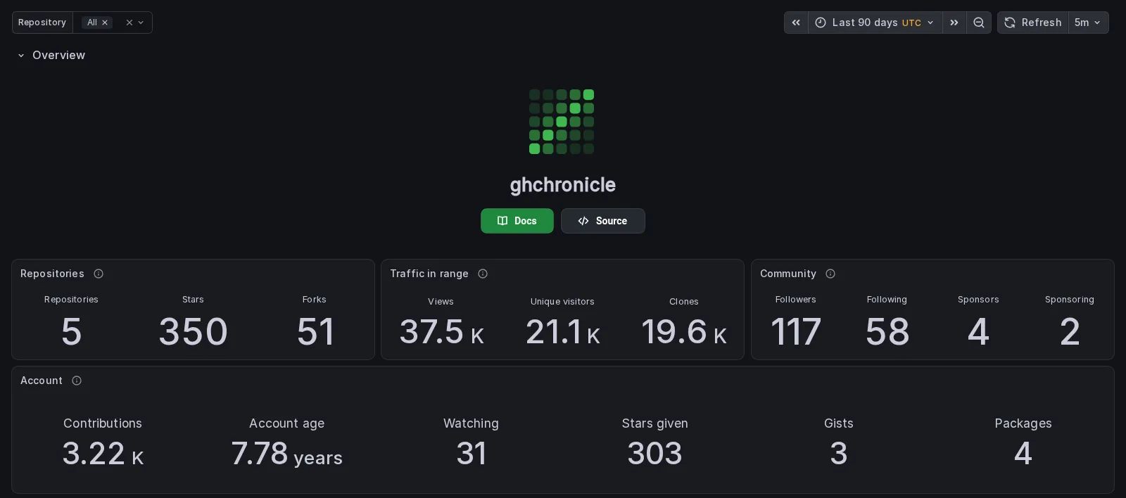
The third traffic tile counts the people who cloned and not the clones. Continuous integration clones all day, so the clone count belongs beside the figure that explains it rather than in a headline: measured on the account this was read against, one repository was cloned 135,683 times in a fortnight by 1,807 cloners, and 186 K beside 2.89 K views reads as an audience. The count itself is two panels of the Audience section. The capture above predates that change and still reads “clones”.
Reads gh_account, gh_repo, gh_repo_total, gh_traffic and
gh_contributions_total.
Lifetime
Section titled “Lifetime”Six numbers that are true since the account began, in one panel, and one row per repository with its whole life in it: pull requests merged and reviewed ever, commits ever, issues opened, what was merged in other people’s repositories and how many threads were commented on there.
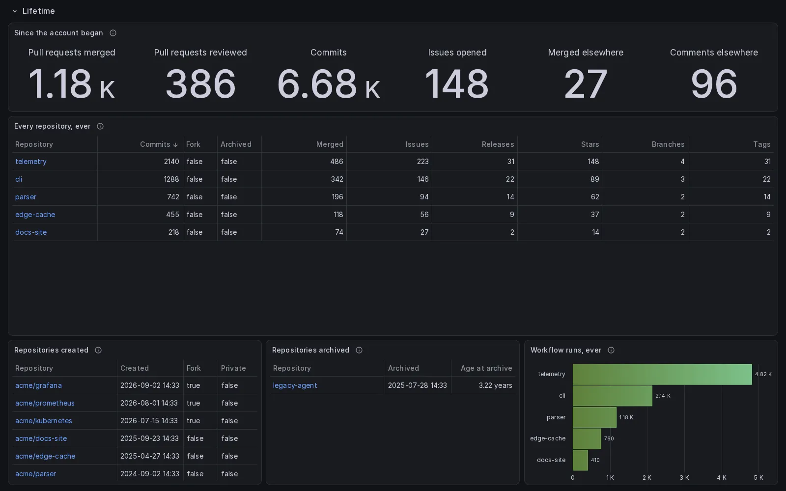
The last tile counts threads rather than comments, each issue or pull request once however many comments the account left on it, and only in repositories it does not own, the same elsewhere as the tile beside it. The capture above predates both: its tile reads “Comments elsewhere”, and its 96 included threads in the account’s own repositories.
Every other section counts rows inside the dashboard range. These do not: GitHub counts them itself, in one search request or one GraphQL field each, and the collector stores the answer as a single row. That is why they are instant and why they are already right on the first sweep of a new install, which a running total kept by this tool would not be. It is also the shape a store can answer without reading everything it holds: InfluxDB 3 Core refuses a query that would open more than its file limit, forty thousand where this was measured, and “how many ever” from a row per fact is exactly that query.
“Every repository, ever” lists every repository the picker holds, forks and
archived ones included when the sweeps collect them, since that is what the
title says. It is ranked by
commits, which on an account with forks of busy projects means somebody else’s
history outranks everything the account wrote: 370,296 commits against 3,385
where this was read. So the fork and archived flags are columns, and the table
opens sorted by the first of them and then by commits, which puts the account’s
own repositories on the first screen and the forks under them without leaving
one out. With All selected it lists the archived repositories the default
filter sets aside as well, with their current counts, whether or not the picker
offers them: a sweep writes them no gh_repo row, which is what the picker
lists, but the same row of each is read again on every totals sweep. One the
configuration no longer collects is left out, as on the Overview, and
Elasticsearch and Graphite apply the Overview’s seven-day rule here too: a range
that ended more than a week ago leaves out the archived repositories the
default filter sets aside. Each row is the repository’s newest in the range,
one per full name, and not the largest value each column reached in it: stars,
branches, tags, releases and open issues go down, and a table of peaks gave a
repository 4 stars from a backfill’s row nine days old where GitHub and its
newest row said 3. A repository archived inside the range has rows from before
the archive and after it, and is still one row in every store. Four of them
flag it archived; Graphite keeps the commits alone, with no fork or archived
column. Elasticsearch keeps an archived row only from the last seven days, so a
repository archived inside a range that ended more than a week ago is listed
there from its rows before the archive, as not archived.
Under the table, the repositories created and the repositories archived, each dated when it happened rather than when a sweep noticed it, and the workflow runs each repository has ever had, from the run listing’s own total.
Reads gh_account_total, gh_repo_total, gh_repo_created,
gh_repo_archived and gh_workflow_run_total.
Audience
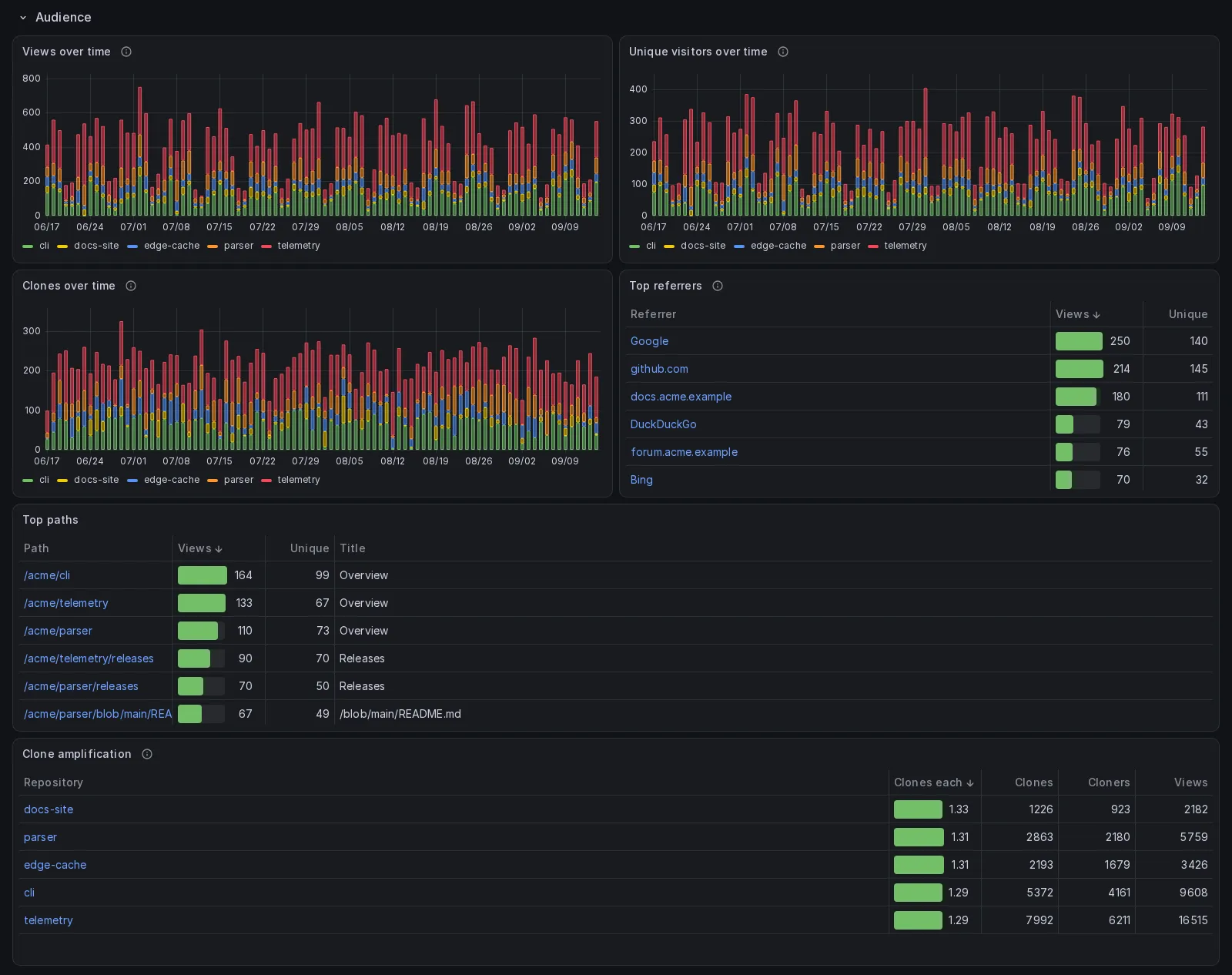
Section titled “Audience”Views, unique visitors and clones over time, the top referrers and the top paths. GitHub serves fourteen days and rewrites the whole window on every sweep, so the series extend as far back as the collector has been running rather than fourteen days. Referrers and paths carry no dates of their own, so they are the newest snapshot of that window rather than a series.
Reads gh_traffic, gh_traffic_referrer and gh_traffic_path.
Stars and forks
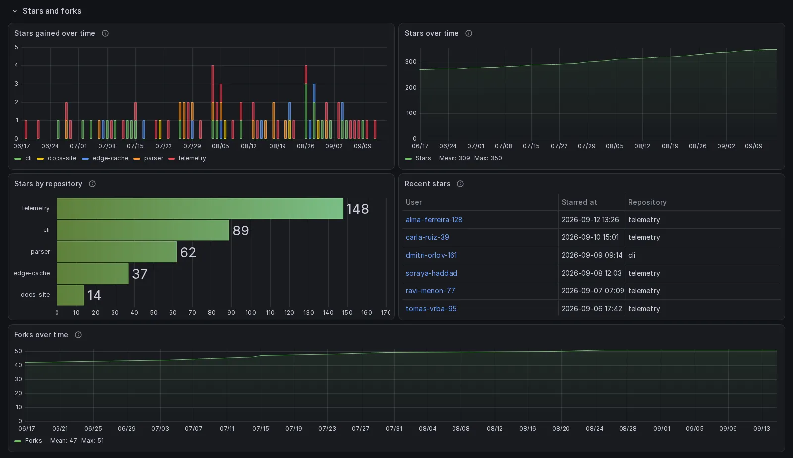
Section titled “Stars and forks”Stars gained over time, the cumulative curve, stars by repository, the fifty
most recent stars with the user and the moment, and forks over time. The eight
repositories that gained the most in the range are named and the rest are
other: of the seventeen that gained a star in two years here, nine gained
between one and three, and seventeen legend entries hid a third of the plot.
Stars gained over time counts gh_star_day, GitHub’s daily star history, and
so does the cumulative curve in InfluxDB and PostgreSQL; ghchronicle reads the
history whole on the first sweep for every repository, except against GitHub
Enterprise Server, which does not serve it. So the curve reaches back to the first star without the collector
having run that long, and a repository whose stargazer list GitHub hides from
the token is counted with the rest: since July 2026 GitHub serves that list only
to a repository’s
admins and collaborators,
and the history to anyone who can see the repository. Each day is GitHub’s
Pacific calendar day, so a star given on a European morning can sit a day before
the moment Recent stars shows, and an unstar of a star given in the last thirty
weeks is taken off the day it was given. The curve usually sits at the count
GitHub shows or a little below it, since that count also includes accounts
GitHub no longer lists, but a star given more than thirty weeks ago and later
taken back can stay in it, so it can also sit above: only a backfill that
reaches back to its day lowers that day, and only while the day holds another
star. Recent stars names people, so it reads gh_star, and a repository whose
list is hidden has its stars in the two panels above it and no names there.
Prometheus still counts Stars gained and Recent stars from the stargazer list,
so only where the token may read it, while its Stars over time is the current
count of every repository; in Graphite and Elasticsearch the curve is the
repositories’ star count as each sweep read it, and starts the day the collector
did.
Forks over time is a running count as well in InfluxDB and PostgreSQL, from
gh_fork, each fork dated when it was made, so it too reaches back past the day
the collector started rather than beginning at the first snapshot. The other
three draw the fork count each sweep read, from the day the collector or the
exporter started. Both curves are drawn to both edges of the
range: a running count over dated rows has a point only where a row is, so a
fork curve over a quiet month was a line from the first fork to the last and
blank on either side, which reads as collection having stopped. Each end carries
a bucket of zero, so the line holds its value to the end of the range.
Reads gh_star_day, gh_star, gh_fork and gh_repo.
Contributions
Section titled “Contributions”The contribution calendar as a series and then as the grid GitHub draws, a column per week and a row per weekday with a cell’s shade a function of that day’s own count; commits per week, the totals of the last year and the mix those totals make, the four kinds of contribution as shares of their sum, which is the radar the profile draws, beside the grid as the profile puts it; commits by hour of day and by weekday, commits by repository, and one row per past year. The grid is a status history panel over one field per weekday, because Grafana has no calendar panel and that is the one core panel that draws a grid of cells colored by value. It is GitHub’s grid measured off the profile page on 2026-09-14 and copied: ten units wide by five draws the profile’s own cell, ten pixels square in a 1920 pixel window, in a gutter of three to four pixels across and five to six down where the profile’s is three both ways; the four greens are GitHub’s dark theme read off that page the same day, over the gray of an empty day; three rows are named, Monday, Wednesday and Friday, as the profile names them; and the shade is the fifths of the busiest day of the year, the rule that reproduced all 366 of the profile’s squares when applied to GitHub’s own counts. The panel keeps that year whatever the dashboard range is set to, the way the profile’s grid is always a year: at five years the same 53 columns would be 262 of six pixels, and at a week two bars. Three things a core Grafana panel cannot copy. The month name over the first week of each month: a status history builds its own x ticks, one every few columns, so a tick always lands on a week and the stride is a function of the panel’s pixel width, which at three weeks writes the same month twice; the ticks name the Sunday each column starts on instead, which no two columns share. The square at every size: a cell is a fraction of the band its row gets, so the square survives at 1920 and again at 768, where the panel takes the whole width of a phone, and between the two the ten pixel height holds while the width narrows, eight at 1600, seven at 1280, five at 430; and where the panel sits on the dashboard it stretches into a tall bar when maximized, 27 by 67 pixels in a 1920 by 900 window and 27 by 84 in a taller one. And a tooltip naming the day and the count, since the cell is colored by the value it carries, so that value has to be the shade and a column is a week. The two punch cards are current state rather than history: every sweep writes the whole grid again, a point per weekday and hour, so a sum over a range would count every sweep. Each panel adds up every cell of each repository’s newest grid in the range, by hour or by weekday, and what the panels are read for is the shape. Graphite keeps each cell as a series of its own, so a cell a rewritten history emptied keeps its last count there, where the SQL stores and Elasticsearch read only the newest grid.
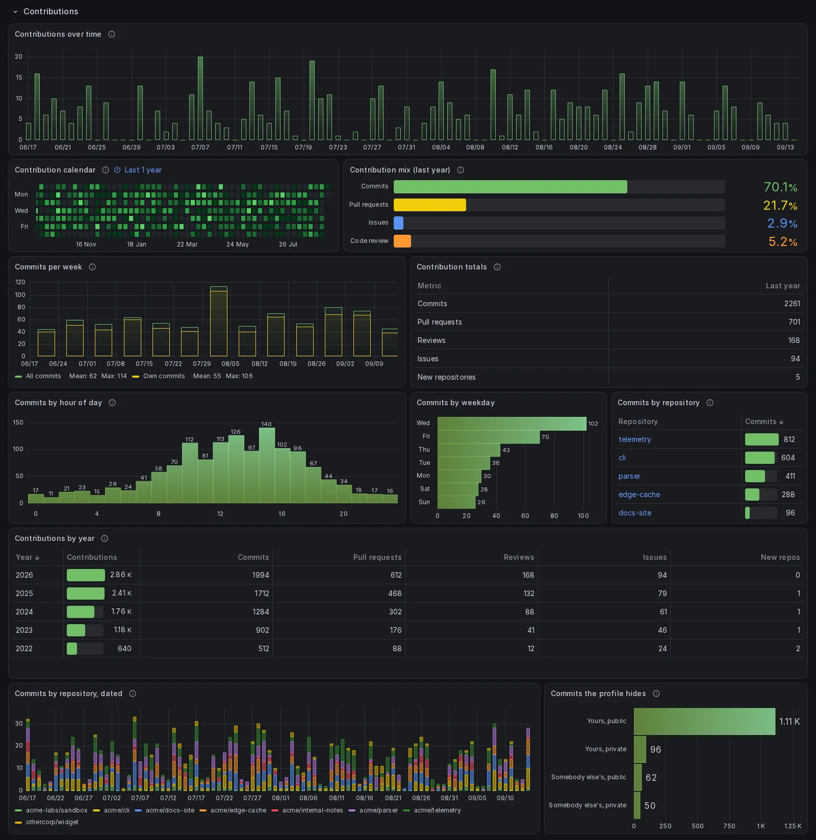
Reads gh_contribution_day, gh_contribution_day_repo, gh_commits_week,
gh_contributions_total, gh_commit_punchcard, gh_contribution_repo and
gh_contribution_year.
Pull requests and issues
Section titled “Pull requests and issues”Fourteen panels, and the section where the per-item collection pays for itself. Merged count, time to merge, time to review by someone else, issues closed, time to close and lines changed as one group of six values; then the same split by state over time, the largest merged pull requests, and the breakdowns by author, by repository and by reviewer. An item still open is written once per day for as long as it stays open, and those rows stay when it closes, so the dated panels count the open ones as distinct numbers under “Open that day” and draw them as a line beside the stack of what closed, and the “open the longest” tables read each item from its newest row. Each keeps the twenty-five open longest, the longest first; Prometheus, which holds no single pull request, lists the twenty-five repositories whose open pull requests have waited longest on average. Elasticsearch can keep the top values only inside each repository’s bucket, so it keeps each repository’s longest open and the table cuts them to twenty-five; before 2.6.1 it kept the twenty-five of each repository with the most rows, which in a repository with more open items than that could be any.
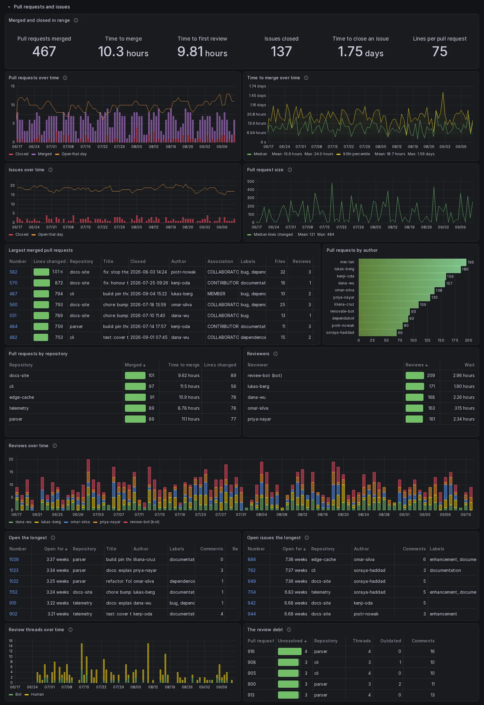
Reads gh_pull_request, gh_pull_request_review, gh_review_thread,
gh_issue and, for the archived and fork flags, gh_repo.
Continuous integration
Section titled “Continuous integration”Fourteen panels: run count, success rate over the runs that succeeded or failed, the canceled and skipped runs beside it, run duration, queue wait, artifact storage and cache size, all seven as one group; then the same figures over time, the workflows, the slowest jobs and the slowest steps, and then the six that say what to do about it: minutes spent on runs that failed, the workflows that keep failing, the steps that fail rather than the jobs, the workflows declared and never run, the artifacts created over time, and how much of the artifact storage was actually counted.
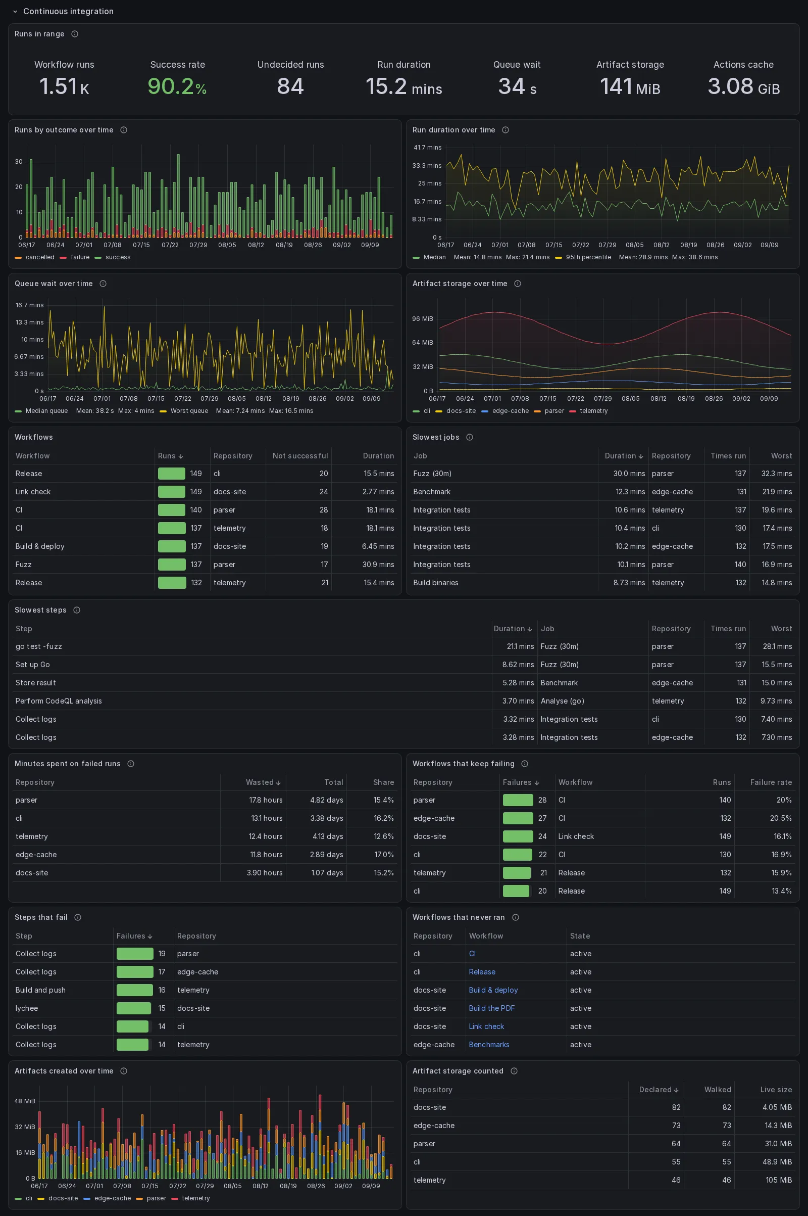
Queue wait is a job-level number. The run-level figure folds the wait into the duration, so a run that took twenty minutes because one job waited eighteen for a runner looks identical to one that spent eighteen executing.
Every median of the InfluxDB and PostgreSQL dashboards is exact, so four jobs that waited 30, 35, 60 and 65 seconds read 47.5 in both, where the estimate InfluxDB used to answer with read 52. The 95th percentile of the run duration and the 90th of the time to merge are still estimates in InfluxDB, since InfluxDB 3 Core has no exact percentile before 3.9.0, and both panels say so.
Two of these are the ones worth looking at first. “Workflows that keep failing”
is not about flakiness: measured, two workflows had failed on every single run
they ever had, dozens of runs apiece, and nobody had switched them off. It
lists a workflow once it has failed more than three times in the range, a
failure being any conclusion but success, and all five stores ask that same
question.
“Workflows that never ran” is the other side of the same question, and it needs
both gh_workflow and gh_workflow_run, which is why it is the one panel here
that only the two SQL stores can answer.
“Artifact storage counted” exists because the total is a floor. GitHub reports how many artifacts a repository has, the collector records how many it actually walked, and when the second is smaller the live size is short: on one repository here, by a factor of fifty six. A sweep’s walk stops at five pages, five hundred artifacts, and any walk stops sooner when a page of the listing fails, the pass keeping what it had read, so either can leave it short. It carries a third count, the live artifacts among the ones walked, because GitHub’s own total includes the ones it has already expired and the size does not. The counts come from each repository’s newest row, the one the tile reads, so a fuller walk earlier in the range cannot hide a short one. The tile at the top of the section is named for what it is over, and every panel that shows the size either shows those counts or says in its description that it is a floor.
Reads gh_workflow_run, gh_workflow_job, gh_workflow_step, gh_workflow,
gh_artifact, gh_artifact_total, gh_actions_cache and, for the archived
and fork flags, gh_repo.
Commits, lines added and removed, the share of signed commits, lines changed over time, repository activity by kind, commits by author and by signature, and the force pushes with who made them and on which branch.
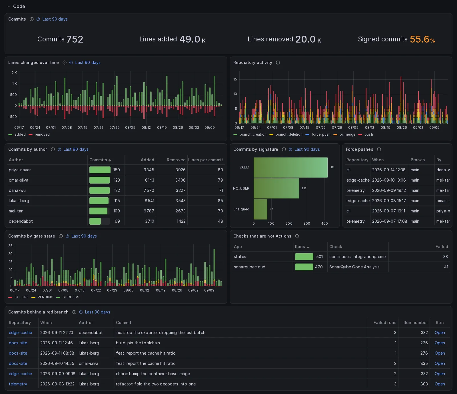
signature separates unsigned, meaning there was no signature at all, from a
signature that failed to verify. They are different facts and the bar chart
keeps them apart.
The last three panels are about the gate rather than the code. “Commits by gate
state” is not the same claim as a workflow run failing: a run says one job
failed, the rollup says the commit itself came out red, and on the measured
account twenty seven of fifty commits on the default branch did. “Checks that
are not Actions” holds what the two sections above cannot see, the code quality
service and the dependency bot. And “Commits behind a red branch” joins
the two by commit hash, which is the one panel that justifies storing
oid and head_sha at all.
Reads gh_commit, gh_commit_check, gh_workflow_run and gh_repo_activity.
Planning and community
Section titled “Planning and community”Labels with how often each is used, milestones with their progress, forks gained over time, the fork list, discussions by category and whether they were answered, and beside that count the discussions themselves: the newest fifty one by one, with their category, comment count, whether each was answered and a link to each, whatever the range, since an account has a handful and a range of a month hid all but one of them under a row that read “Ideas”.
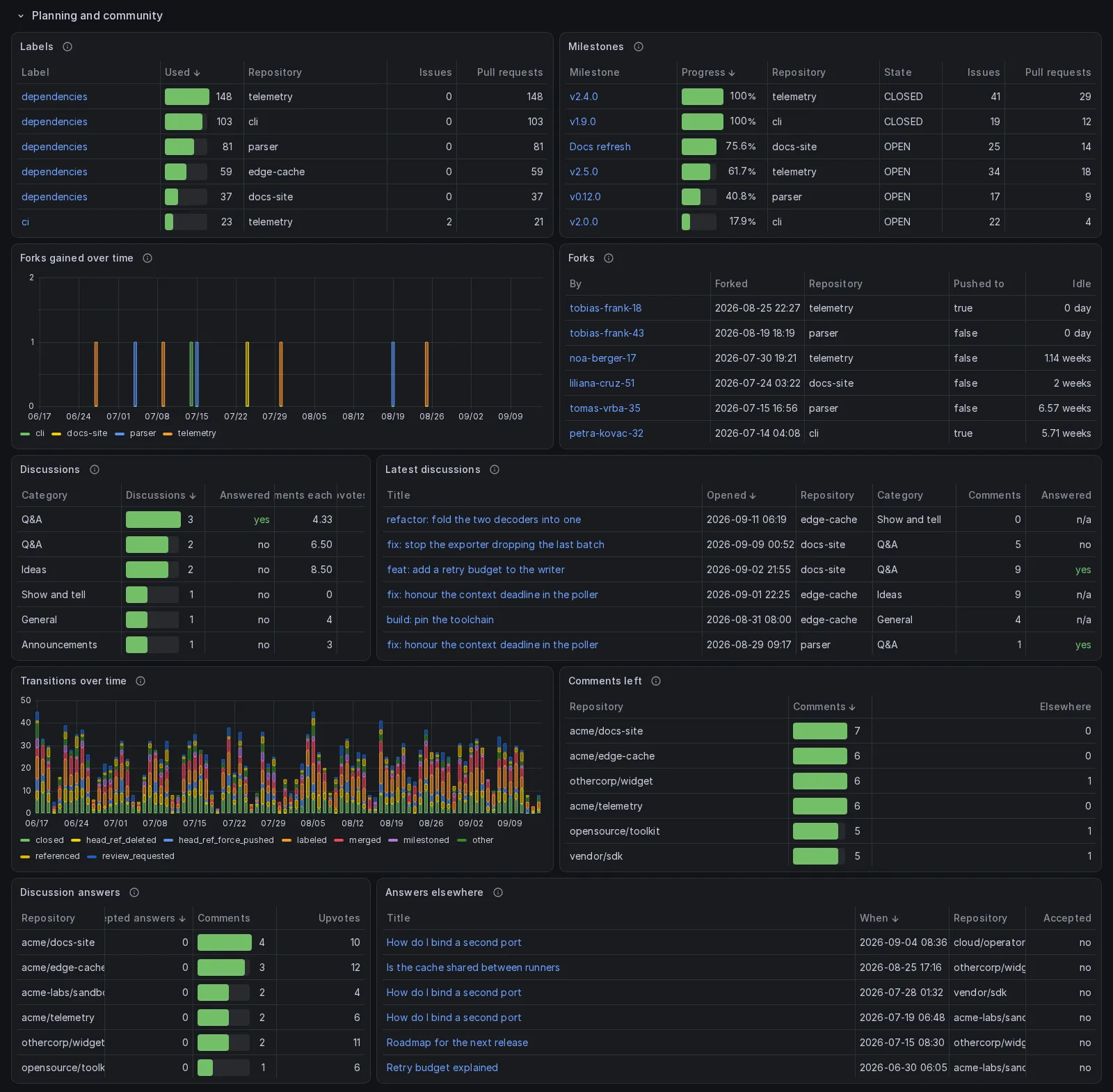
The fork list carries advanced, which is what separates a real derivative
from a bookmark. Most forks are bookmarks.
Three more panels are about the conversation rather than the plan. Transitions over time is when something was labelled, closed, reopened or renamed, which the state of an issue does not record: a reopening exists in no other measurement. The two comment tables count what was written anywhere, including in repositories the account does not own, which is where most of it happens: the comments left in other people’s repositories outnumbered the discussions inside the account by more than an order of magnitude when this was measured. Beside the per-repository count of discussion comments, the comments themselves: every one left in a discussion of somebody else’s repository, newest first, with whether the maintainer accepted it as the answer and a link to the comment in its thread. Both read one row per comment in every store, accepted when any of its rows says so, since a store written before 2.6.1 and since can hold a comment in more than one row, for the reason How to read the tables gives.
Reads gh_label, gh_milestone, gh_fork, gh_discussion, gh_issue_event,
gh_issue_comment and gh_discussion_comment.
Delivery and access
Section titled “Delivery and access”The webhook failure rate, deliveries by status code, the endpoints ranked by failures, the rulesets and the deploy keys with how long each has gone unused. Under those, the configured webhooks, the environments, the stale branches, the branch protection rules, each ruleset’s rules with who may bypass them, when each ruleset was changed, and the deployments over time and by environment.
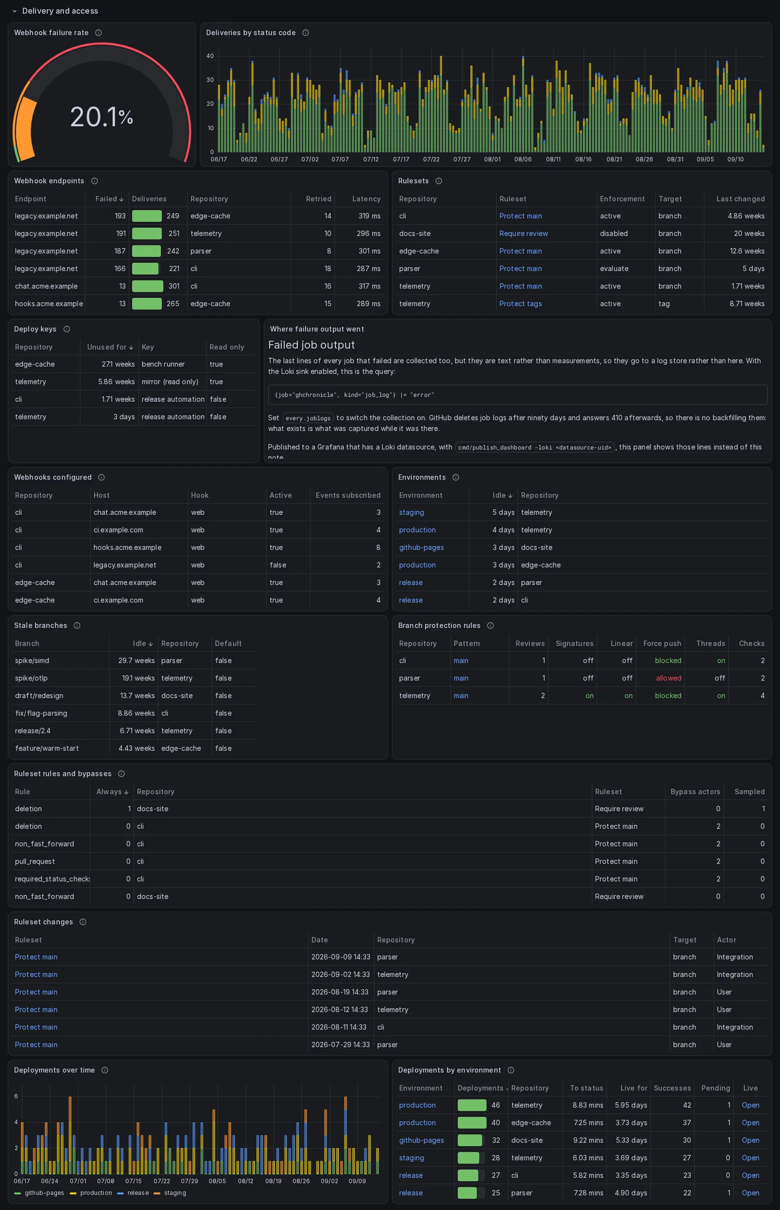
Webhooks fail silently. Measured, one hook had been answering 403 for seventy-eight of its last hundred deliveries and nothing anywhere said so. Only the host of a webhook URL is stored, because the path usually carries a secret.
One panel is text in the exported files, “Where failure output went”,
because the output of a failed job is text and belongs in a log store, and an
importer may have none: a dashboard bound to one datasource cannot query two.
Published to a Grafana with a Loki datasource, which the collector adopts or
makes from a Loki sink or takes from grafana.datasource.loki_uid, the same
panel draws the last lines of every failed job from Loki instead, newest first,
with the workflow, job and run of each line in its logfmt tail. The repository
variable is applied in the InfluxDB, PostgreSQL and Prometheus dashboards; the
Graphite and Elasticsearch variables name the glob star as their All value,
which is not a regular expression, so there the panel shows every repository
and says so.
The last two are inventories rather than traffic. “Webhooks configured” exists because the endpoint table is built from deliveries, so a hook that has never delivered anything appears in it nowhere, and an active hook with no traffic is exactly the interesting row. “Environments” asks the deploy key question about deployment targets: one environment here had not been touched in one thousand one hundred and seventy seven days.
Reads gh_webhook_delivery, gh_webhook, gh_ruleset, gh_ruleset_rule,
gh_ruleset_version, gh_deploy_key, gh_environment, gh_branch,
gh_branch_protection, gh_deployment and, for the archived and fork flags
of the stale branches, gh_repo.
Releases
Section titled “Releases”Total downloads, downloads by release, and every asset with its size and its own download count.
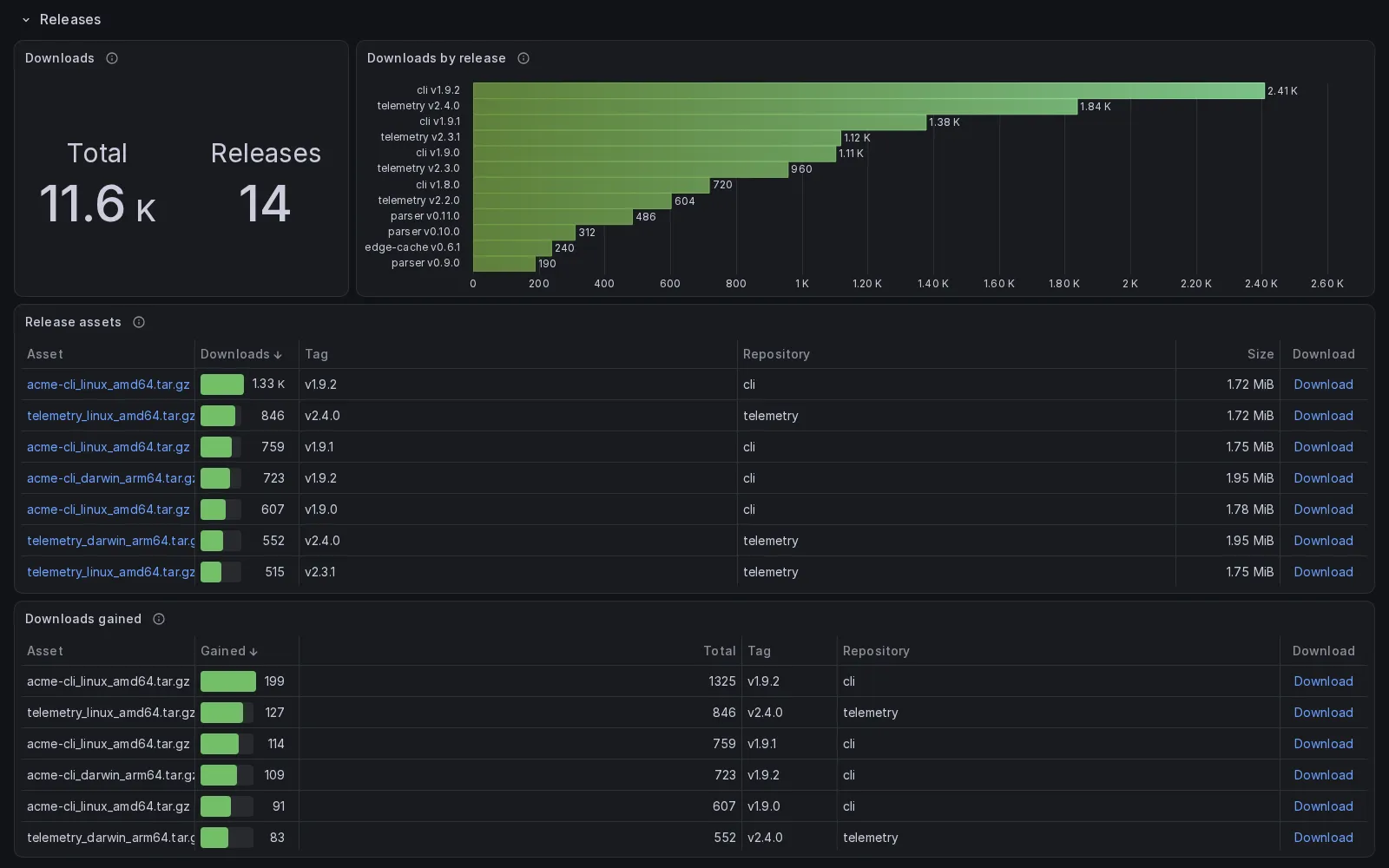
The first three are current state. GitHub reports a running total per asset and never a history, so the series that a downloads-per-day panel would need does not exist to be collected. The fourth panel is what can be recovered from it: the difference between the first and last value inside the range, which is what each asset actually gained. A day of that on the measured account showed ninety seven per cent of the downloads going to one Linux binary and its checksum file, which is an installer rather than a person.
Reads gh_release and gh_release_asset.
Security
Section titled “Security”Open Dependabot and code scanning alerts, the breakdowns by severity and by ecosystem, open alerts over time, the feature table, and the time taken to resolve an alert by severity. Under those, the oldest open alerts, the security settings, the default code scanning setup, the workflow token permissions and the secrets with when each was last rotated.
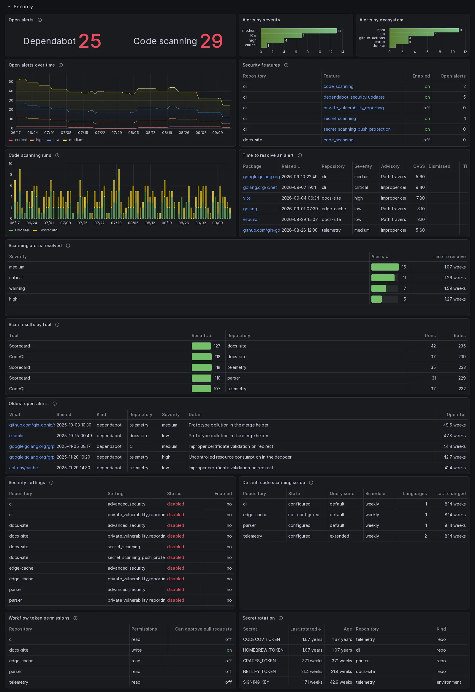
The feature table is what tells “no alerts” apart from “the feature is switched
off”. Without gh_security_feature, a repository with Dependabot disabled
looks exactly like one with nothing to fix.
The alert counts are current state, rewritten on every sweep, so every panel
that counts open alerts takes the newest row of each series and adds those up
rather than summing the range. Summing the range counts each alert once per
sweep: before this was fixed the tile read 3.61 thousand where the account had a
few dozen. A series is a repository by its full name, so two owners’
repositories of one name are two, as they are in the artifact and cache bytes of
“Runs in range” and in “Downloads”, which add up their newest readings the same
way. The feature table and the four tables at the foot of the section, the
settings, the code scanning setup, the token permissions and the secrets, are
current state too, and read each repository’s newest row, so a feature switched
off or an alert fixed inside the range reads as it stands and not as it was at
its highest. Elasticsearch does the same by narrowing each series to its newest
document and reading that, and is the exception in one place, which says so in
its description: its curve of open alerts takes the largest series of each
severity in a bucket rather than adding them. Graphite is the exception in
three, and says so in each: its settings, code scanning setup and token
permissions name each row from the path, of which a setting’s status, the
setup’s state, query_suite and schedule, and the permissions are part,
so a change inside the range is two rows, the old one and the new.
Two panels are new information rather than a different view. Time to resolve a code scanning alert comes from dates that were being downloaded and thrown away, so until now only the open count existed; of thirty four alerts on one repository, thirty were fixed and three dismissed, and all thirty three were invisible. Scan results by tool says what a scan found rather than that it ran, which is what explains a jump in the alert count.
“Oldest open alerts” lists the alert rows that say open, which are not always the rows those counts are made of. A sweep writes a row for each of the newest hundred alerts of a repository, and a repository with more has its counts taken from a read of the open ones alone. So an open alert behind a hundred newer ones, raised before the collector started, is counted and not listed, and an alert fixed while it sat behind the newest hundred stays listed as open, until a backfill reads the whole list.
Reads gh_dependabot_alert, gh_dependabot_alert_item,
gh_code_scanning_alert, gh_code_scanning_alert_item,
gh_code_scanning_analysis, gh_security_feature, gh_security_setting,
gh_code_scanning_setup, gh_actions_policy and gh_secret.
Gross, the part covered by the plan, what was actually billed, Actions minutes, cost over time by product, minutes over time by SKU, and usage by repository.
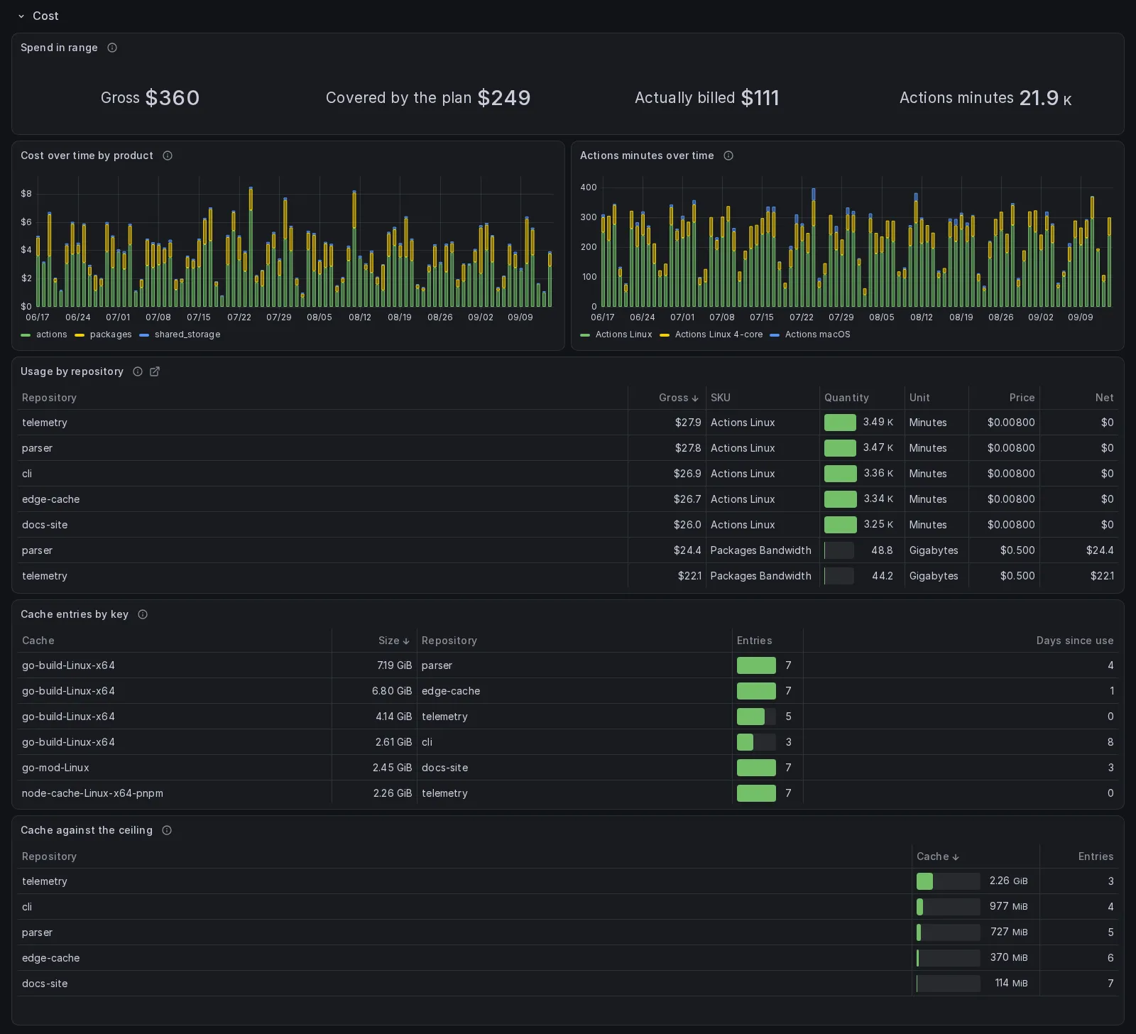
Gross, discount and net are all stored rather than one being derived from the others, because net is not always zero and the discount is where a monthly credit shows up. The price per unit is in the table for the same reason: it is what explains thirty thousand macOS minutes costing more than two hundred and forty thousand Linux ones. A repository can appear in that table and in no other panel, because the list that bills and the list that is swept are not the same list. A charge that belongs to no repository, which is what a Copilot seat is, is left out of that table in every store: it is a row of the bill and not a repository called (none). The spend totals above it include it.
The two cache panels are about the ceiling. GitHub caps a repository at ten
gigabytes and evicts the least recently used entry past it, so the bar is each
repository against that cap and the panel is read for the distance left; the
entry table says which key is being thrown away and which has not been touched
for a week. Each row of that table is one cache of one repository as it stands:
the rows of the last day in the range the collector read that repository’s
caches, one per ref, added up, so Entries counts the entries GitHub holds and
not the rows the table read. A ref GitHub evicted keeps its last row in the
store, and adding each ref’s newest row in the range counted it: on the
account this was checked against, one cache read 128 entries and 9.46 GiB over
108 refs where the newest day, and GitHub, held 44 and 3.08 GiB over 24.
InfluxDB, PostgreSQL and Elasticsearch read each repository’s newest day.
Graphite cannot find it, so it reads the last UTC day of the range: its table
is empty from midnight UTC until the day’s first actions pass, and it shows
the size alone, since a Graphite table keeps one column. Prometheus holds the
value last pushed for each ref, so an evicted ref still counts there until the
exporter drops it a day later, or, pushed over OTLP, until the process
restarts.
Reads gh_billing_usage, gh_actions_cache and gh_actions_cache_entry.
Activity
Section titled “Activity”Events over time, events by type and by repository, notifications by reason and kind, notifications over time, and the work done in other people’s repositories. Both dated panels bucket by the range rather than by a fixed hour or day.
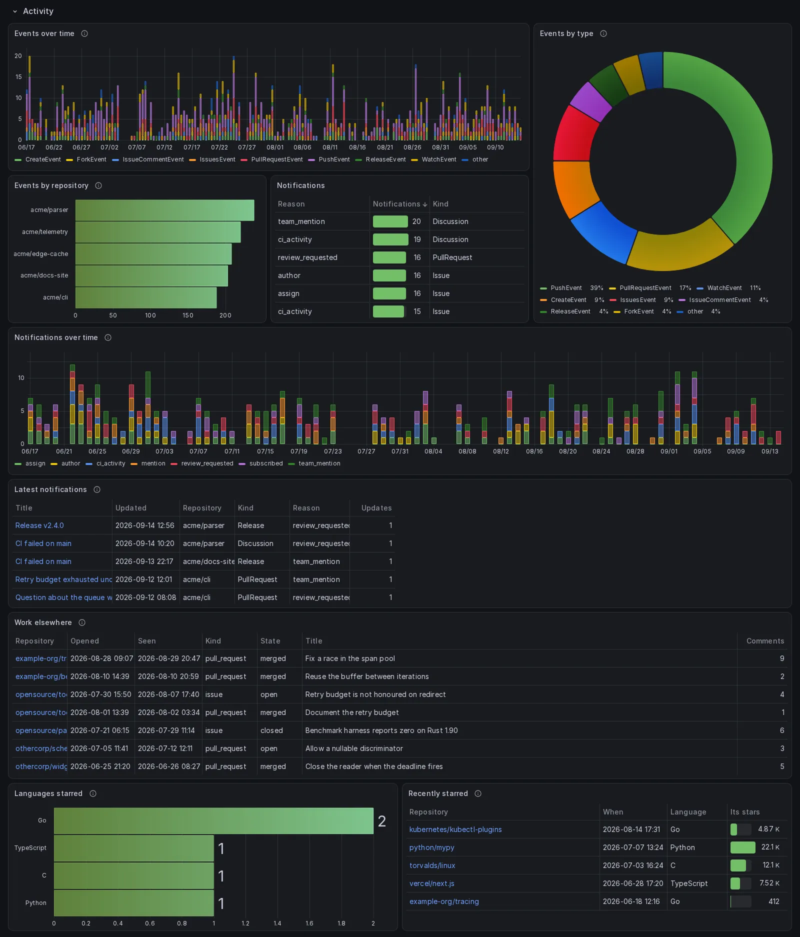
Events and notifications are windows, not histories. GitHub keeps the last three hundred events of the past thirty days and drops notifications after three months unless they are saved, so what is stored is what was there when the sweep ran.
The donut carries the share of each type in its legend and writes nothing on the slices, because Grafana leaves a label off a slice it does not fit and the thin slices never got theirs. The legend is a list under the chart rather than a column beside it, measured rather than chosen: under 992 pixels Grafana puts every legend under the chart and caps it at 35 per cent of the panel, whatever the panel asks for, and a legend placed beside the chart is drawn there as a column, one entry per line, that ended after seven entries on a phone; a list placed under the chart wraps, and at the height the pie has, the eleven types of a month all fit at 360 pixels. Each type is a slice in a color of its own and under its own name in every store: the query answers a row per type, and the panel makes each row a field, because Grafana colors a pie by field and a column of counts is one field, which drew every slice the same green.
The last two panels are the mirror of the stars section: what this account starred rather than what was starred, by language and by project, dated when each star was given. Whether the projects are small or famous is a different question from how many there are, so the second table carries their own star counts. The Prometheus exporter keeps the language of each star and not its repository, so there the second table has a row per language, with the mean star count of the repositories starred in it.
The table of work elsewhere carries the same number for the repositories the
account contributed to: each one’s star count at the newest sweep inside the
range, from gh_upstream_repo, joined onto every item in the InfluxDB and
PostgreSQL dashboards and beside every repository in the Prometheus one.
Graphite and Elasticsearch cannot join two measurements in one panel and leave
the column out, saying so. The outbound family writes that measurement since
2.6.0, so a range with no row of it, which is every range before the upgrade,
has an empty Stars column. Until the first outbound pass of 2.6.0 writes it,
InfluxDB and PostgreSQL have no table to join and refuse the whole panel rather
than leave the column empty, which
the troubleshooting page
covers. InfluxDB, PostgreSQL and Elasticsearch list each item once, from its
newest row in the range, and Elasticsearch has no Opened column, since that
date is the row’s own less how long the item was open, a subtraction a bucket
cannot make. Prometheus has a row per repository, and Graphite one per item and
state, since the state is part of the path: an item seen open and then closed
inside the range is two rows there.
Reads gh_event, gh_notification, gh_external_contribution,
gh_upstream_repo and gh_star_given.
Inventory
Section titled “Inventory”Code by language, the community profile score per repository, the repository table, the topics, the packages, the gists, and the container tags with the moment each was published. Under those, the repository settings, the account keys, the social accounts, the configuration changes, the policy files, the Dependabot ecosystems, and the dependencies by licence, by ecosystem and as they changed.
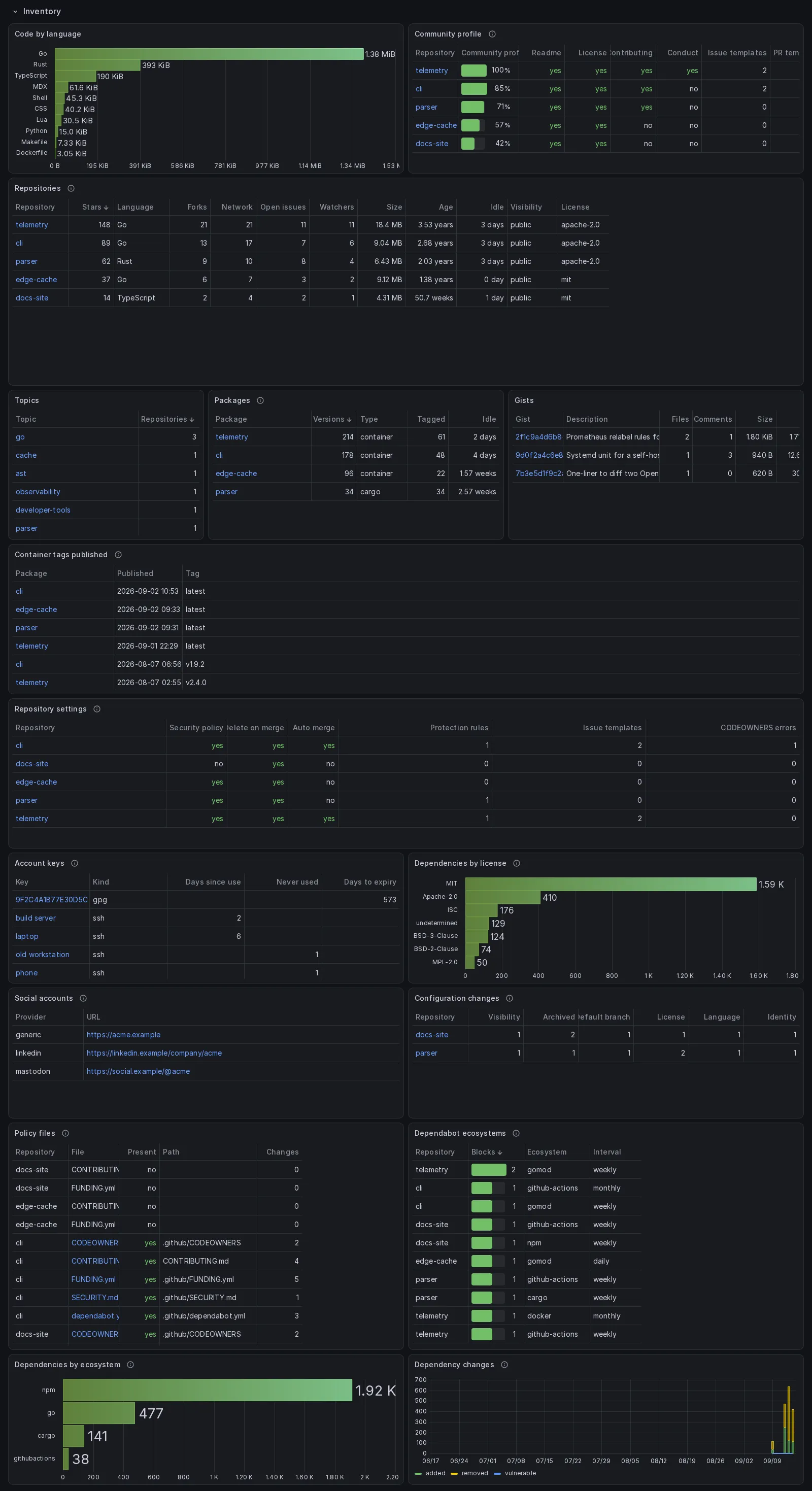
open_issues in the repository table is GitHub’s own field, and GitHub counts
pull requests in it. gh_issue is what to count issues with.
The community profile shows the boxes behind the score as well as the score,
because the percentage hides which one is missing: on the measured account
eight of thirty-five repositories have no licence. The issue template box is
not GitHub’s: the API’s issue_template flag reports only the legacy single
ISSUE_TEMPLATE.md file, not a templates directory, while the community page
and health_percentage do count the directory, so the flag said “no” for every
repository of an account whose repositories score 100 with four issue forms
each (the gap is filed as community/community#207706). The column is the count
of templates the repository actually has, forms and Markdown, from
gh_repo_policy.issue_templates, joined to the profile row per repository in
the InfluxDB, PostgreSQL and Prometheus dashboards; Graphite and Elasticsearch
cannot join two measurements in one panel and keep the API’s flag, saying so.
The settings table is the same idea for what a repository allows, and
codeowners_errors is the entry in it that fails silently, since a broken
CODEOWNERS file stops requesting reviews and says nothing. The account keys
table is where an SSH key that has never been used shows up, and where the
expiry of the key that signs every commit is written down.
The last panel is empty almost always, and that is the point: a row in
“Configuration changes” means a repository was renamed,
archived, made private, relicensed or had its default branch moved. Identity
counts distinct repo_id values, which is the only way to tell a rename from a
new repository, because GitHub publishes no rename history at all.
Reads gh_repo, gh_repo_language, gh_repo_community, gh_repo_topic,
gh_repo_policy, gh_package, gh_package_version, gh_gist, gh_key,
gh_social_account, gh_policy_file, gh_dependabot_ecosystem,
gh_dependency, gh_dependency_license and gh_dependency_change.
Profile and sponsorship
Section titled “Profile and sponsorship”What the profile advertises and what Sponsors moves: the money in and out, the sponsorships in both directions, the tiers on offer, the pinned items, the profile flags, the star lists, and the achievement badges with the distance from each to its next tier.
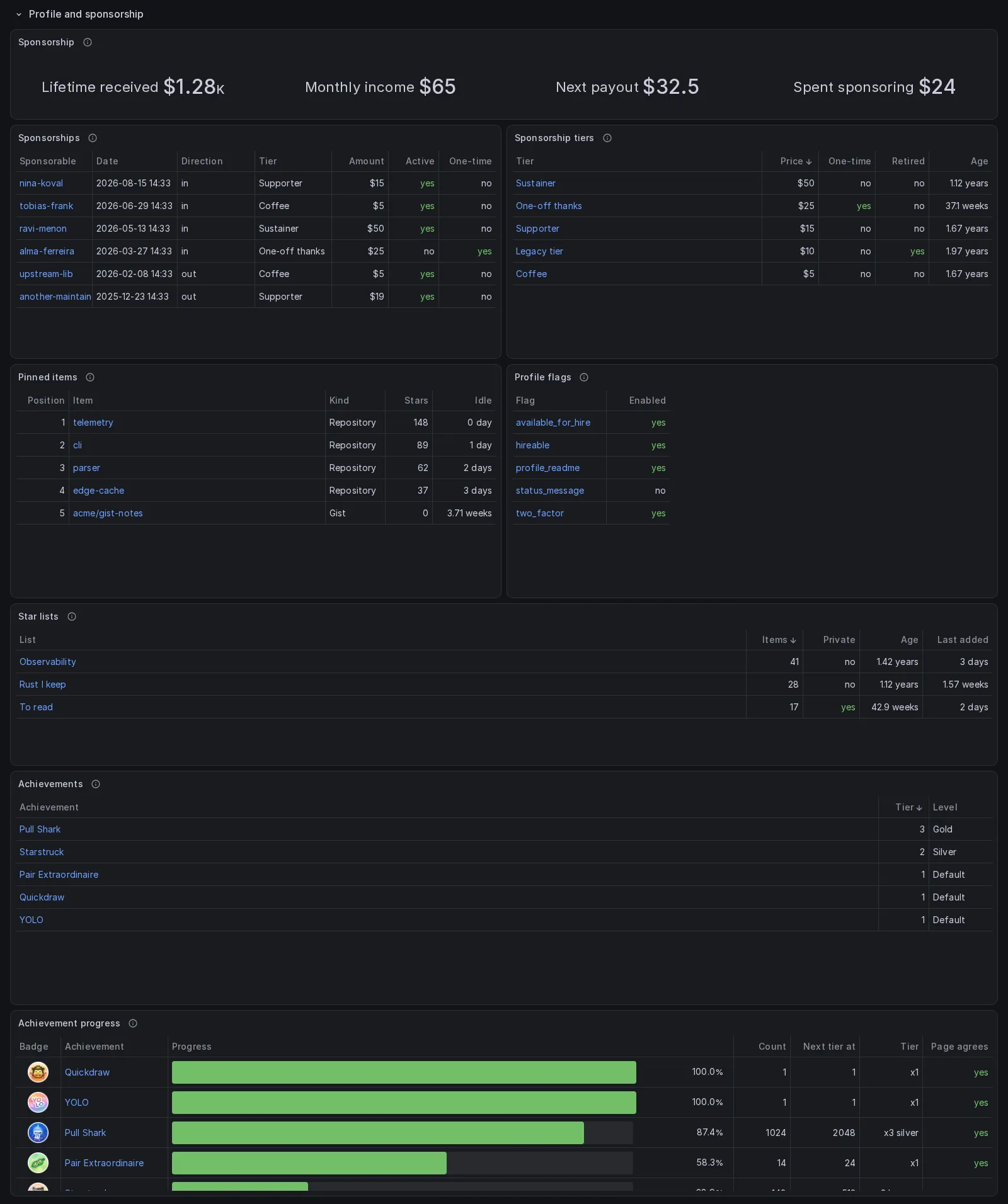
The four figures are the newest reading of a snapshot rewritten every sweep and not a sum over the range, which would report the lifetime total once per sweep. The lifetime total is the one that keeps the history: the monthly estimate goes to zero the moment the last sponsorship lapses, and the money that did arrive stops being visible anywhere else. What is spent sponsoring is not the spend in the Cost section, which is what GitHub charges for Actions, packages and storage; this is money that leaves for somebody else’s work.
The tables under it are inventories rather than histories, and they say so by
naming their own window: a sponsorship made in 2021 is listed at the default
thirty days, where a panel on the dashboard’s range would draw an empty axis
over a handful of rows spread across years. A sponsorship is dated the day it
began and not the day of a payment, both connections are read with activeOnly
off so a lapsed one is recovered, and the sponsorable is the literal word
private when the other party is hidden, with no link guessed at. The tiers are
anchored to the start of the UTC day for the same reason: dated at their
creation they would all fall outside every range and read as no tiers at all.
Pinned items carry the position as a field and not a tag, because a repository that moves from slot two to slot three is the same pin, and as a tag every rearrangement would fork the series. The repository filter at the top of the dashboard does not reach that panel: a pin can be a gist, which is named by its hash and is in no repository the filter knows.
The achievements are read every hour from the public profile page, because no API lists them. The count behind Pair Extraordinaire, merged pull requests in public repositories with a co-authored commit, is a tally the state file keeps: each hourly pass adds the pull requests merged since the last day it covers, and the whole history is walked again once a week, which is when a count that went down, a repository made private or deleted, comes down in the table. Without a state file every start walks it whole. Next tier at is the community-observed threshold (Schweinepriester/github-profile-achievements) rather than a number GitHub publishes, so the last column says whether the profile page agrees with the tier the count implies; a row that disagrees is a rule the page contradicts, and it carries no target and no bar. Both achievement panels are empty until that family has run once.
Reads gh_sponsors_listing, gh_sponsorship, gh_sponsors_tier,
gh_pinned_item, gh_profile_flag, gh_star_list, gh_achievement and
gh_achievement_progress.
The collector itself
Section titled “The collector itself”What the collector has left to spend and what it managed to do: the budget of each of GitHub’s fifteen independent rate limits over time, a table of all of them ordered by how much of each has been used, and under those two the row’s own report on the sweep.
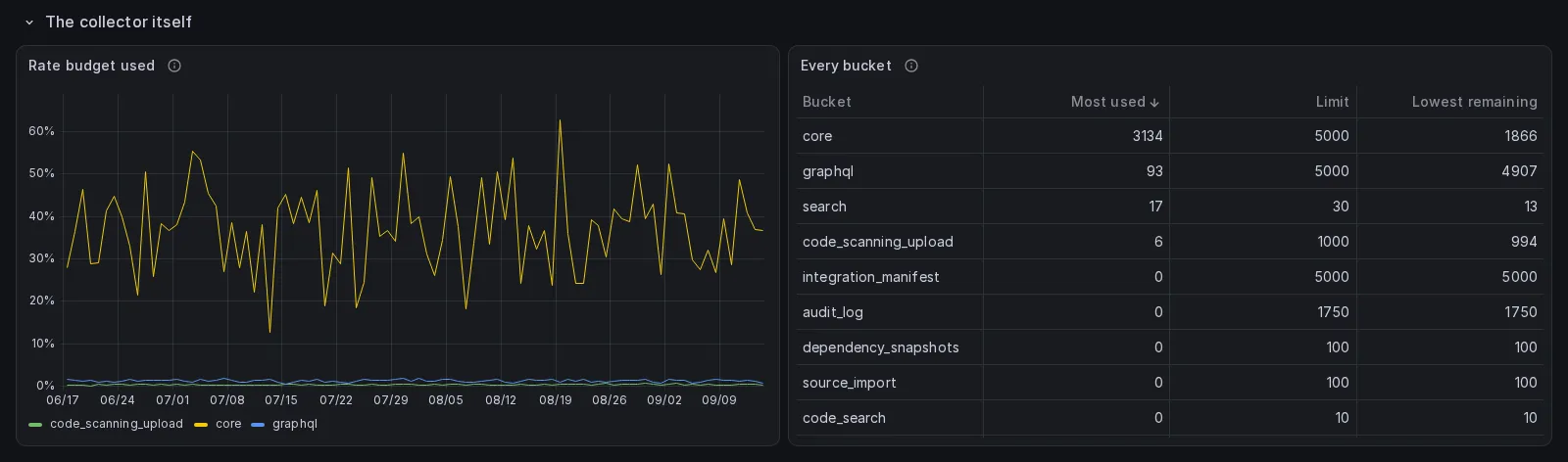
The chart shows only the buckets with more than thirty requests in them,
because search has thirty a minute and would flatten the axis. Reading all of
this costs nothing: GET /rate_limit is the one endpoint GitHub does not
charge for. Without it, a family skipped because a bucket was spent looks
exactly like a family with nothing to report. Most used and Lowest remaining
in the table are the extremes of the range, the most any reading spent and the
least any had left, so a bucket spent an hour ago still says so after it has
refilled; Graphite keeps the lowest remaining alone.
“Every family” and “What failed, and where” are the two panels below them, and
the capture above predates both. The first lists every collector that ran in
the range, what stopped it where something did, how many sweeps it ran in and
the most repositories one of those sweeps asked it about, which for commits,
issueevents and issues includes the repositories the
movement query found nothing
new in and the family left unread; a family with no row there did not run at
all. The reason is a column of its own so that the two kinds of failure sort
apart: a spent search budget is not the 502 that cost a repository
its history, and a family that met both has a row for each. The second is one
row per repository one collector could not collect, newest first, with what
GitHub answered. An empty second table is the
good case, and it is drawn empty rather than refused because the first table’s
rows are written every sweep whether or not anything failed, so the measurement
behind both exists from the first one.
They are there because of a failure this page could not explain. On 2026-09-16
five repositories of this account held no workflow run or job at all, each
because one call for the jobs of one run had answered 502 once and the
collector had thrown away everything it had gathered for that repository. The
Continuous integration row was drawn over an account missing its five busiest
repositories while the Cost row on the same page reported one of them burning
27.6 K macOS minutes. Neither panel takes the repository variable: the family
rows belong to no repository, and a repository a sweep could not collect may be
one the variable does not list, since the variable is built from rows the same
sweep writes.
Reads gh_rate_limit and gh_collector_family.
The Link column
Section titled “The Link column”Every table whose rows are items on GitHub selects a column called Link, the
row’s url, and hides it: the link hangs on the table’s first column, the
name of the thing, and opens the row’s own page in a new tab. On a phone the
column at the far right was reached in two tables of twenty-eight, and the
first column is always on the screen; for the same reason the column a table
is sorted by is its second, and a date is shown to the minute rather than the
second. A few tables link from another url the row carries: Recent stars opens the person who gave the star, Top
referrers the host that sent the visitors, Deployments by environment has a
second column, Live, for the environment’s own address. Release assets keeps
its file under Download, which fetches the binary, and adds the release page
as its Link; a click on a bar of Downloads by release opens the release too.
Where the page is one GitHub shows to the owner alone, the settings of a
repository, its traffic graph, an alert, the link’s hover title says so.
The column reaches a store only where that store’s query returns it: the two
SQL stores select it by name and Elasticsearch buckets on url.keyword, so a
document without one lands in an empty cell rather than out of the table.
Prometheus carries no url and Graphite keeps no string, and each of their
tables says in its description that the Link column of the InfluxDB dashboard
is absent there. cmd/check_dashboards holds every link column of a rendered
dashboard to that: the column has to come back, and hold nothing but absolute
urls and empty cells, a null from the SQL stores or the empty string of that
bucket.
When a store cannot answer
Section titled “When a store cannot answer”The stores cannot answer identical questions, and the panels say so rather than pretend.
- InfluxDB and PostgreSQL hold a row per fact, dated when the fact happened, so they draw the traffic of a particular Tuesday, the star curve since 2018 and the merge time of a pull request closed in July. The PostgreSQL set is the InfluxDB SQL translated, because the SQL sink writes the same facts as tables, and it compares text by its bytes as InfluxDB does, so a list is in the same order in both whatever collation the database was created with.
- Prometheus stamps every sample at scrape time, so the exporter reduces
the per-item rows to current values plus, for the counted measurements, a
monotonic
_totalof distinct items seen since the exporter started.increase()over that is how the “per day” and “over the range” panels are answered. - Graphite keeps the dated points but has no rows: a table there is one or two numbers per series reduced over the range, so a table that needs several fields of one row keeps the numbers a row of it can carry and names every column it drops, a string is not a metric there at all, and a boolean is kept as 1 or 0 like any number.
- Elasticsearch keeps the dated documents, so a per-item table is the
newest documents themselves, or the newest document of each item where an
item has several, and everything else is a bucket aggregation, on the
.keywordsub-field of each tag.
Graphite and Elasticsearch share two limits the SQL stores do not have. Neither can join two measurements in one panel, so Work elsewhere has no Stars column there and the community profile keeps the API’s issue template flag rather than the count of templates. And neither can ask about one window while reading another, so the archived repositories the default filter sets aside count on the Overview and in Every repository, ever from their rows of the last seven days, and a range that ended more than a week ago leaves them out.
A chart or a bar chart the SQL stores fold, its busiest series named and the rest one called other, folds the same way in Graphite, and in Prometheus where the exporter holds the counts it would add up. Elasticsearch cannot, since a terms aggregation says nothing of the values it does not keep, and each panel there that draws every series says so.
Each panel whose twin in another store is richer says so in one sentence of its description.
Twenty-four panels have no Prometheus answer at all
Section titled “Twenty-four panels have no Prometheus answer at all”Top paths, the contribution calendar, the two commit punch cards and the two per-repository splits of the calendar, the largest pull requests, pull requests by author, the issues open the longest, the review debt, the slowest steps, the steps that fail, the workflows that never ran, the artifacts created over time, the commits that left the branch red, the latest discussions and the answers left elsewhere, release assets, what each asset gained, the oldest open alerts, events by repository, the latest notifications, container tags and the configuration that changed. The exporter either skips the measurement, drops the identity the panel is about, or the panel is a join between two of them.
Where failure output went is a text panel in every store, this one included: it is a note about where to look, not a query.
Three of those are joins or set differences and have no answer in Graphite or Elasticsearch either, for the same reason: an aggregation runs inside one index or one tree, and these need two. The calendar has none in either for a different one: the grid needs the week along one axis and the weekday along the other, and a date histogram or a summarize buckets by one interval. Each of the two loses a little more on its own account: Graphite the oldest open alerts and the latest notifications, because it stores numbers and not the strings those tables are made of, and Elasticsearch what each asset gained, which is the difference between the first and the last value of the range.
They are still emitted, as text panels with the same title saying what they would show and why the store cannot, so the layouts stay identical.
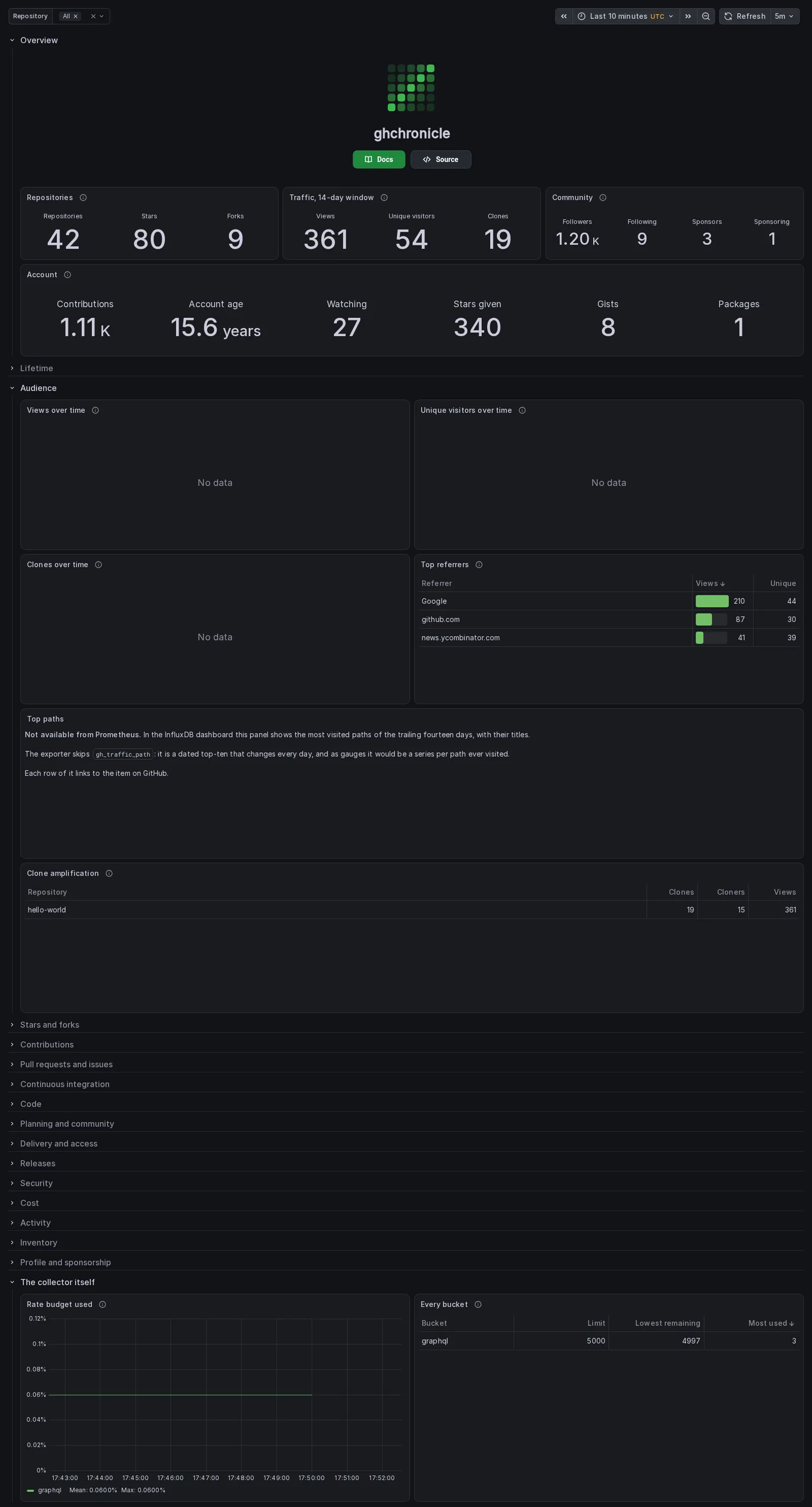
That capture is of no account at all. It is the Prometheus dashboard of the
containerised end-to-end suite (test/e2e/docker), where the collector sweeps
the fake GitHub of test/e2e/fakegh, whose account is octocat with one
repository, and Prometheus scrapes the exporter every five seconds. The range
is the ten minutes it had been collecting when the capture was taken, which is
what makes it worth showing: every number on the Overview, and both tables of
the Audience section, is a current value, because a current value is all the
exporter can serve; Rate budget used is a flat line, because a gauge repeated
at every scrape is a flat line; Top paths is the text panel described above;
and Views, Unique visitors and Clones over time read “No data” because
they floor their bucket at a day and this Prometheus is minutes old. On a
server that has been scraping for months those three draw, starting the day the
exporter did.